Creative design meets strategic development for brands that demand more than average —
What
I do.
A comprehensive approach to digital design, blending strategic thinking with crafted execution.
Brand Identity
Design
Web Design &
Development
UI/UX
Design
Marketing
Design
Website Design &
Development
I design and build fast, responsive, and easy-to-use websites. From the initial layout to the final code, I make sure your website looks great and works perfectly on all devices.
What's included
- arrow_forwardUI/UX Design
- arrow_forwardWeb Design
- arrow_forwardWeb Development
- arrow_forwardAI-Assisted Design Workflows
Graphic Design &
Branding
I create clean, professional, and memorable branding for your business. Whether you need a new logo, business cards, or full brand guidelines, I deliver designs that connect with your audience.
What's included
- arrow_forwardBrand Identity Design
- arrow_forwardLogo Design
- arrow_forwardTypography
- arrow_forwardVisual Systems
- arrow_forwardDesign Systems
- arrow_forwardCreative Direction
- arrow_forwardMarketing Design
Section 01 — Branding
Visual
Identity
01 — Project
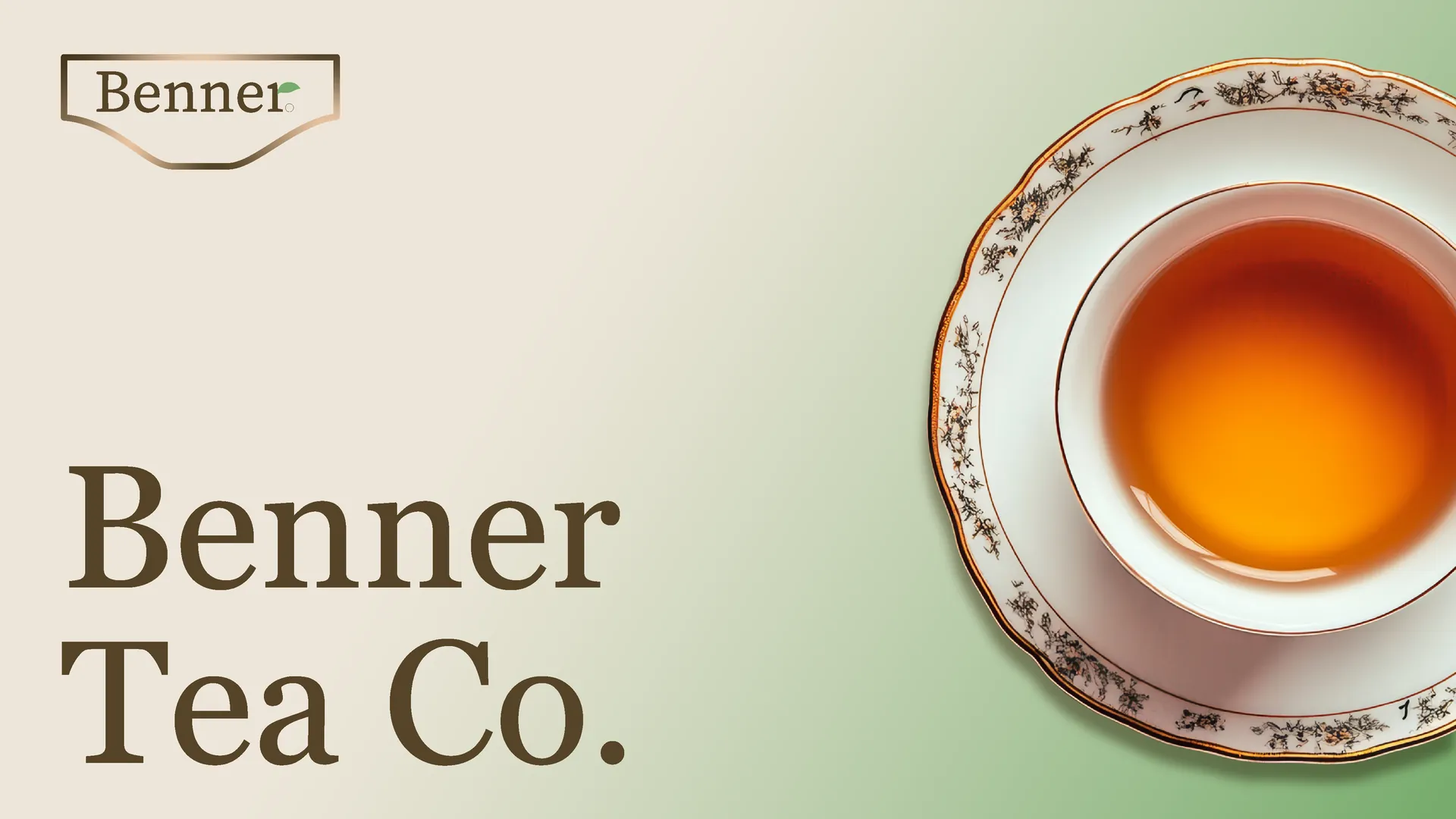
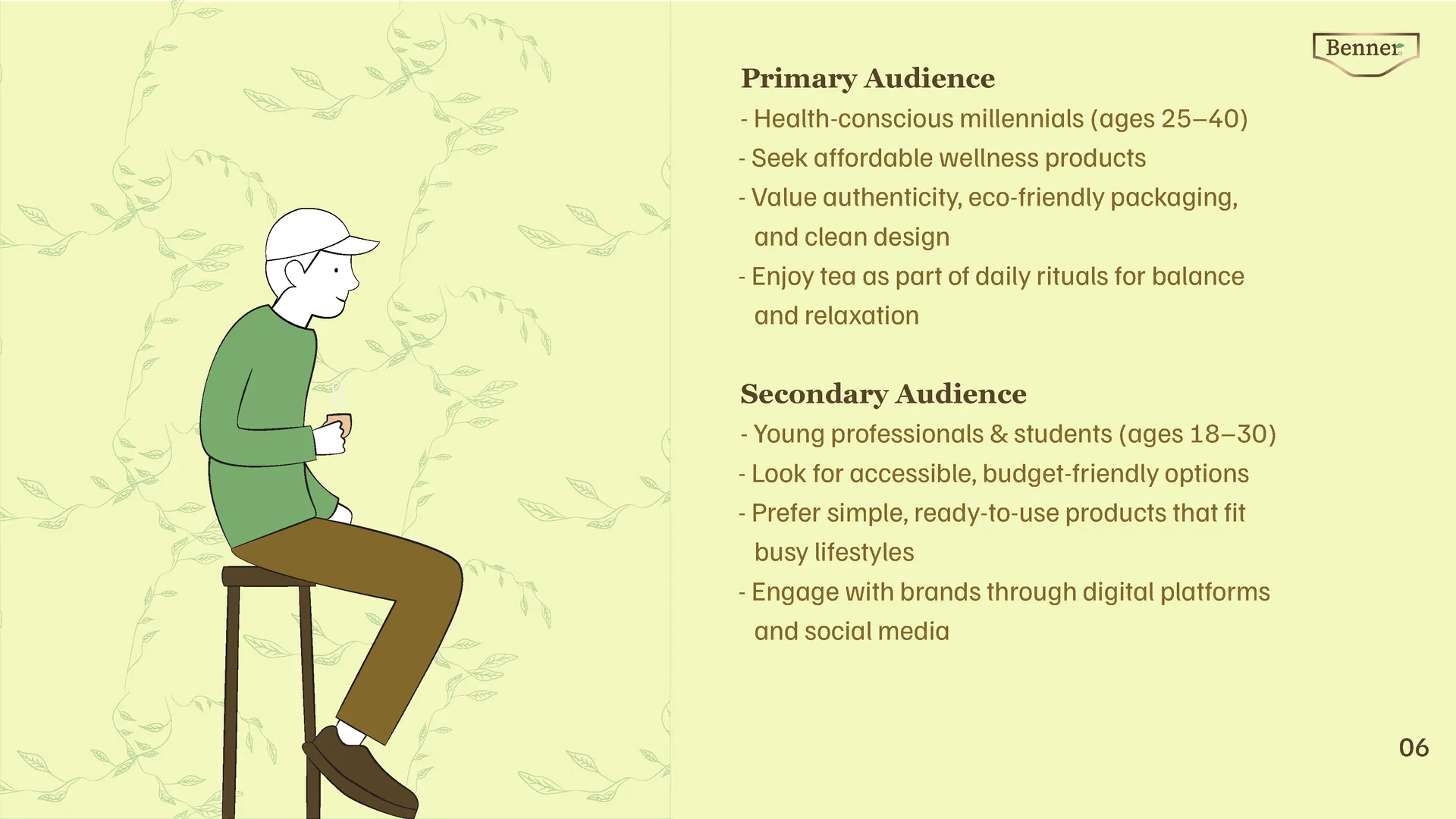
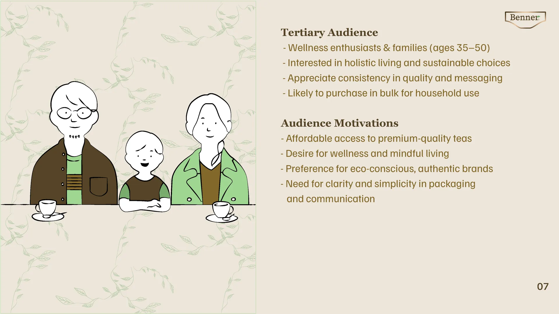
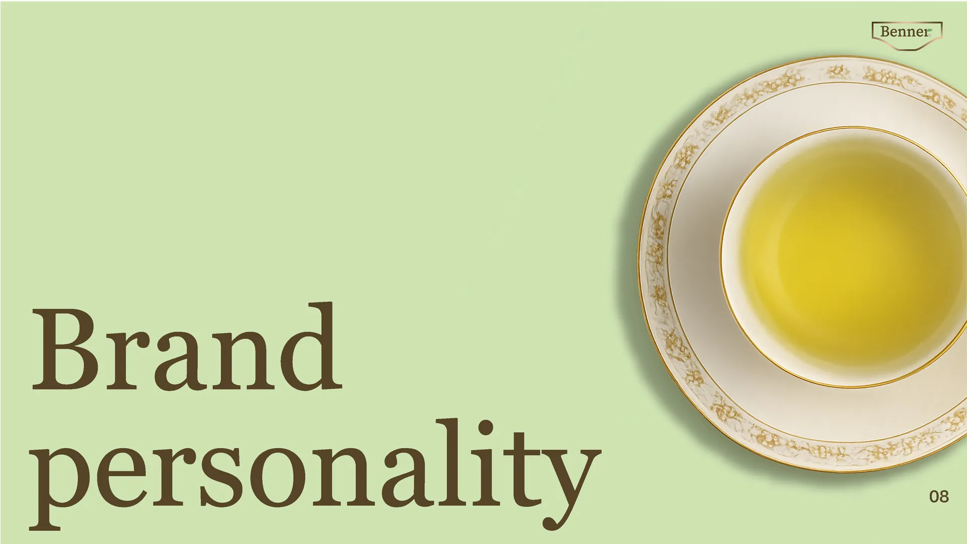
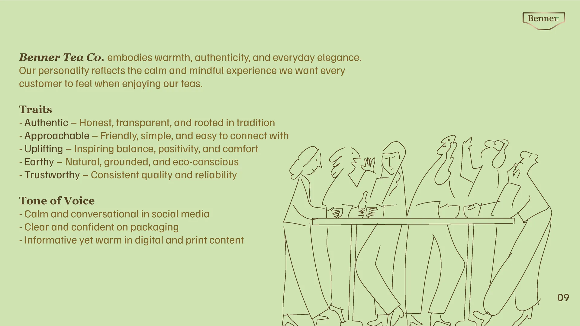
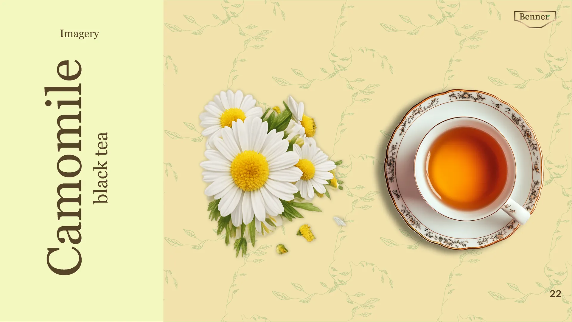
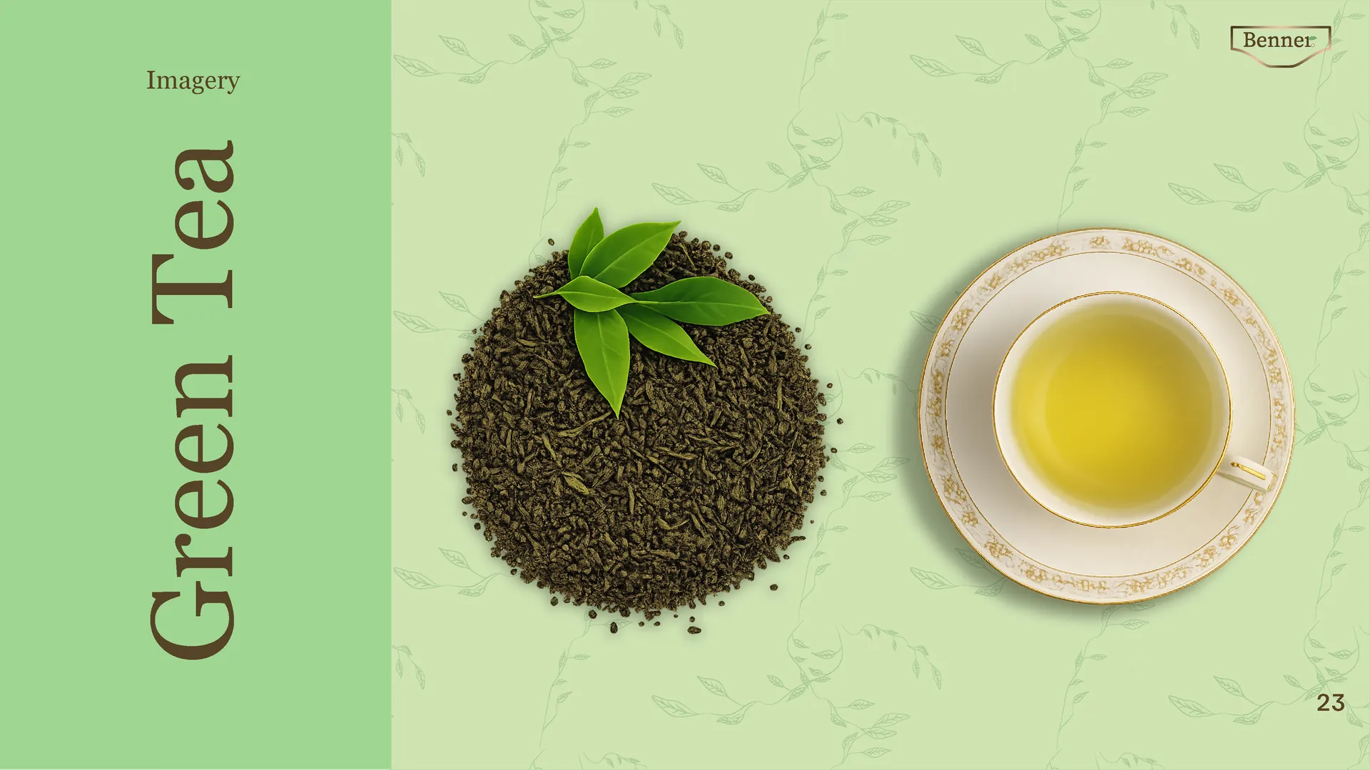
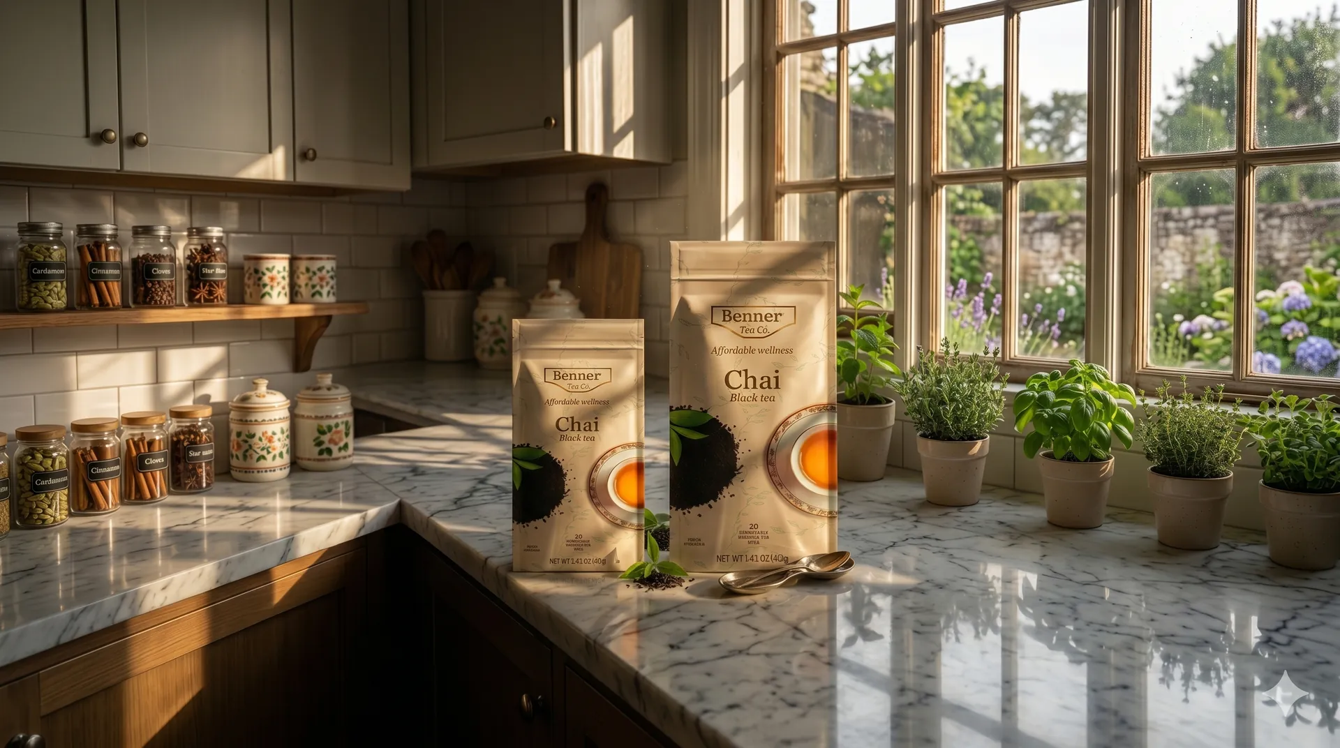
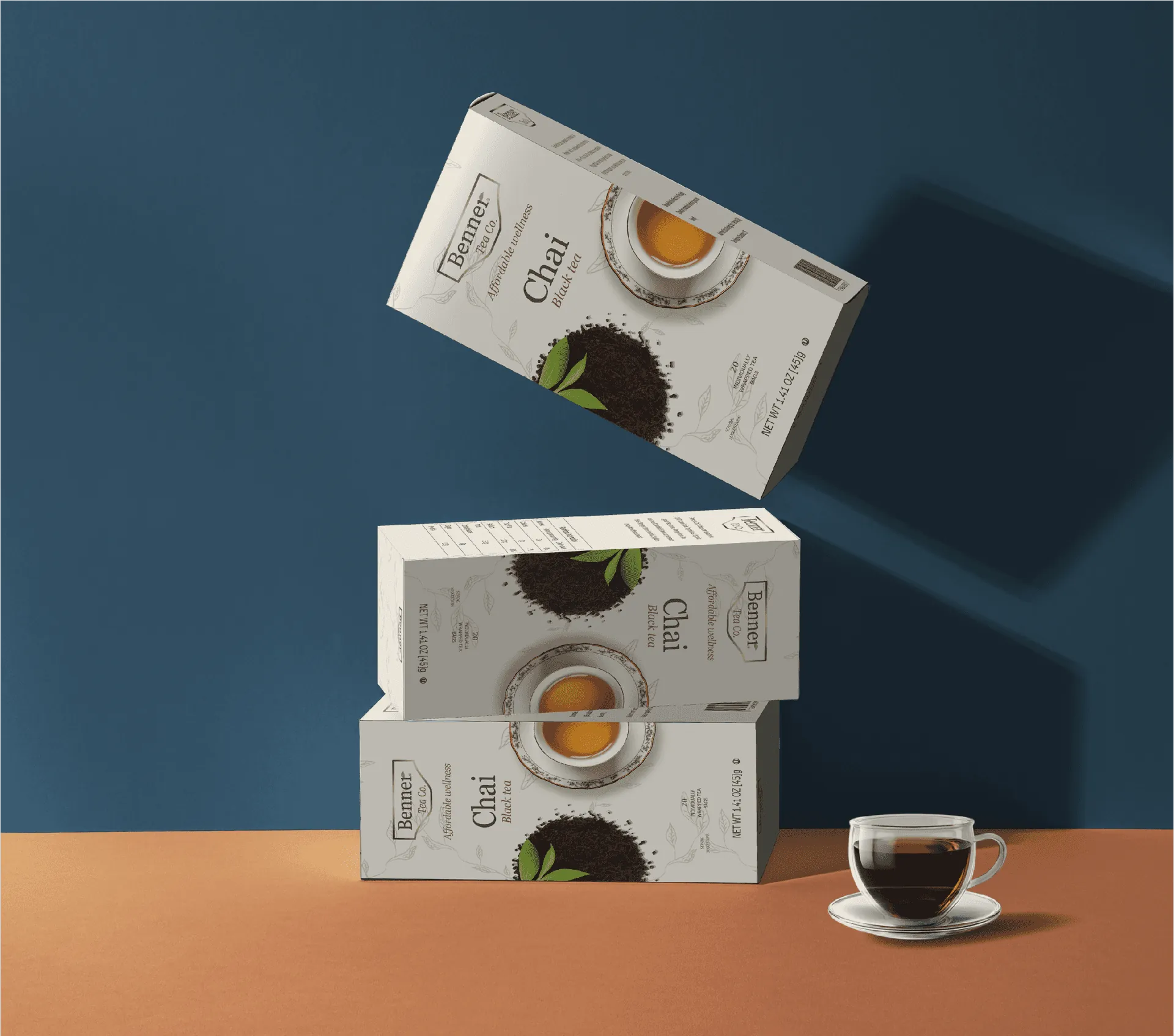
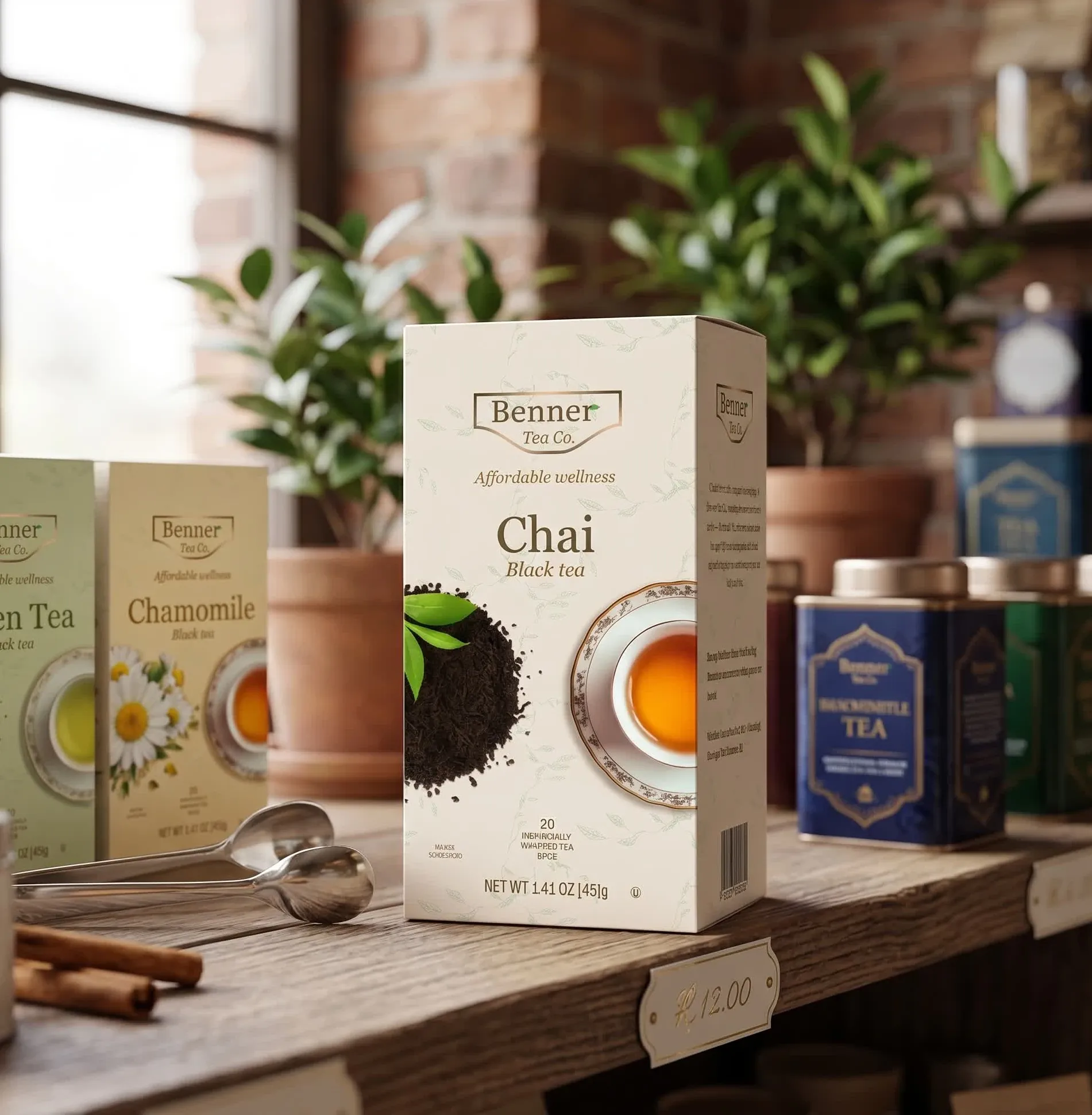
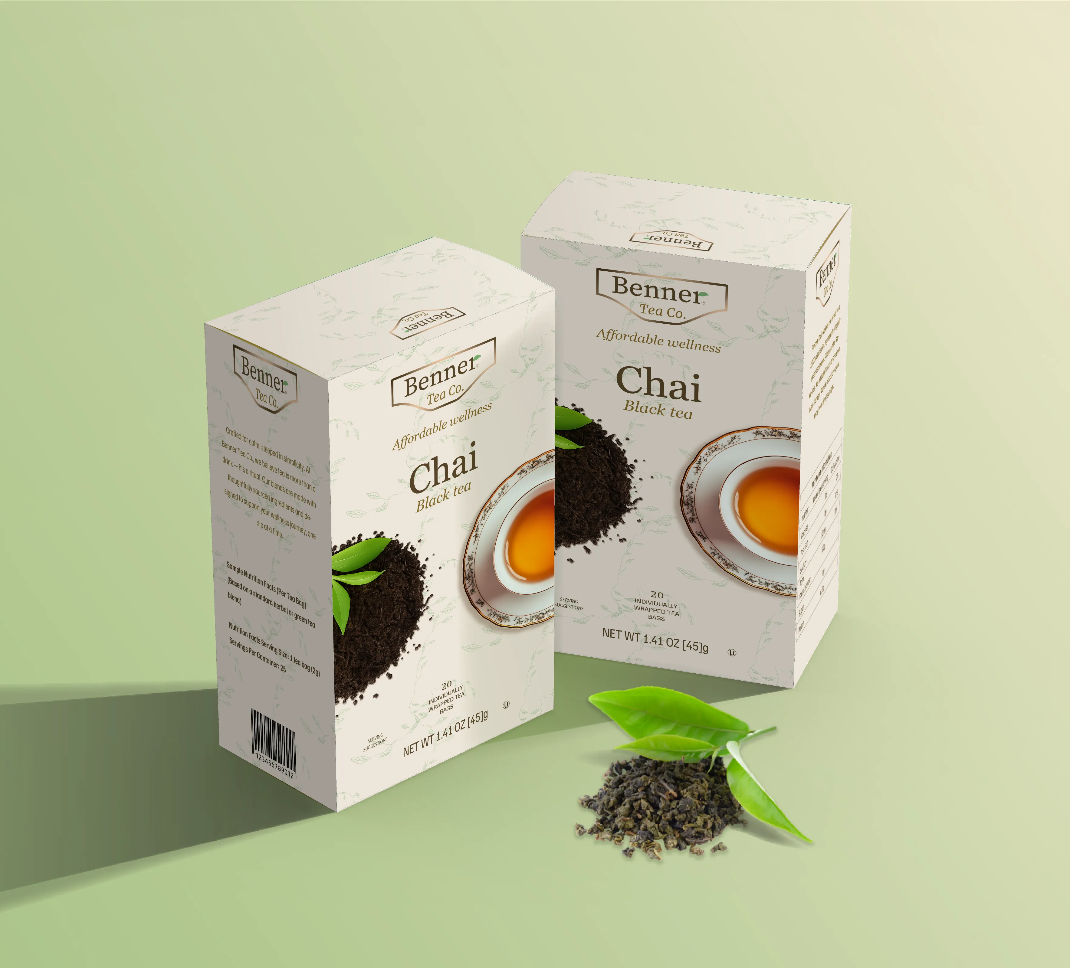
Benner
Tea Co.
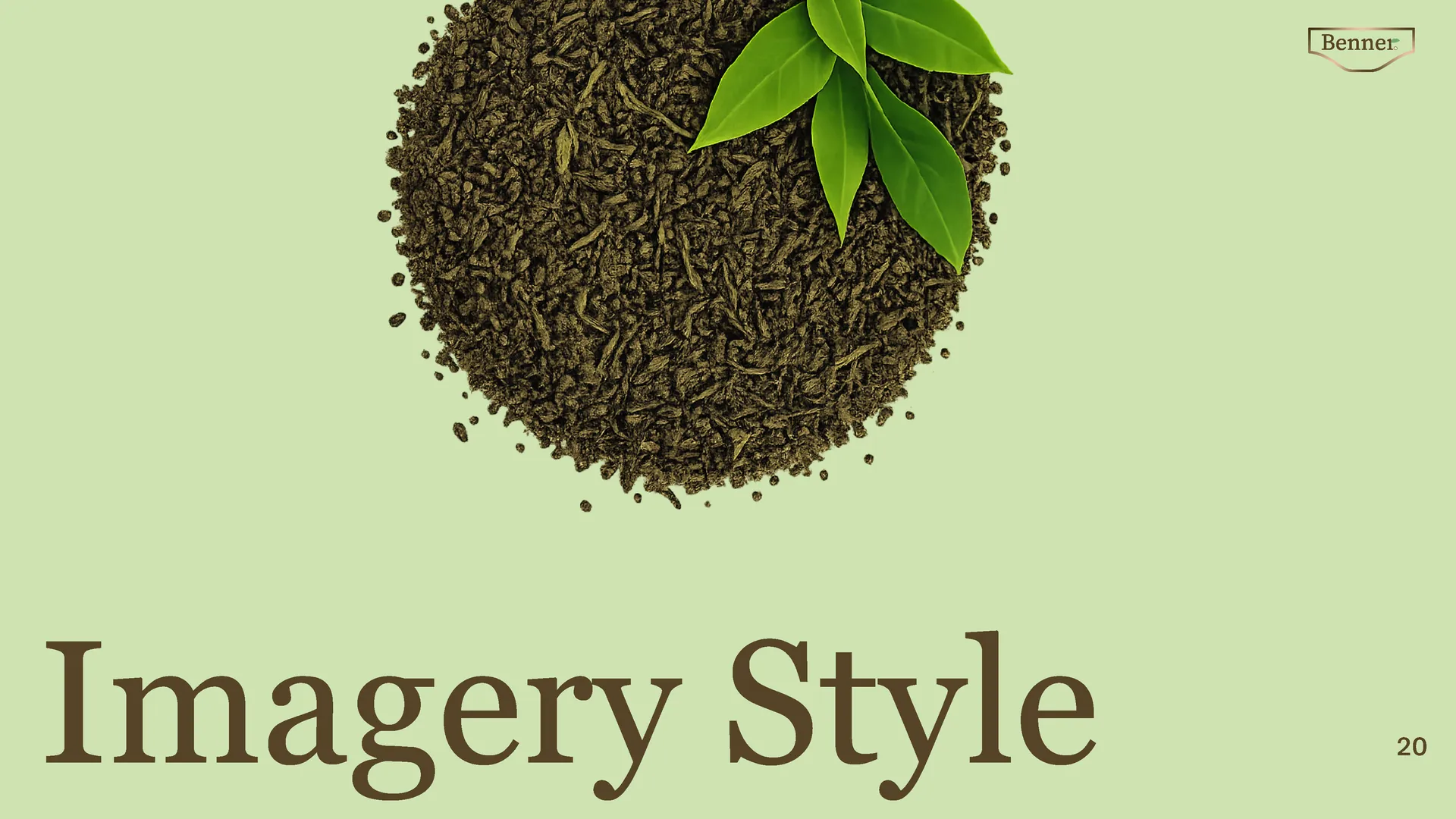
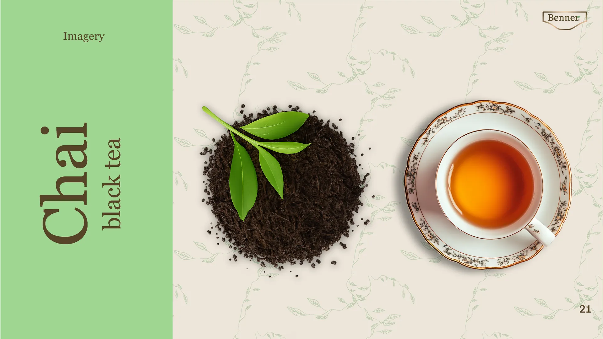
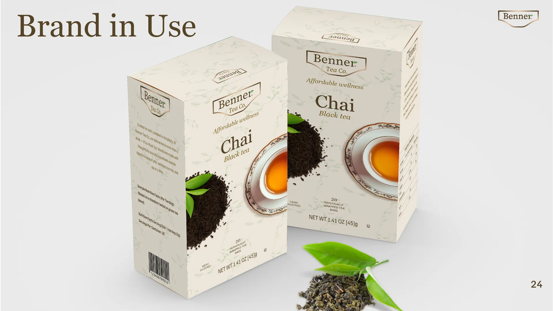
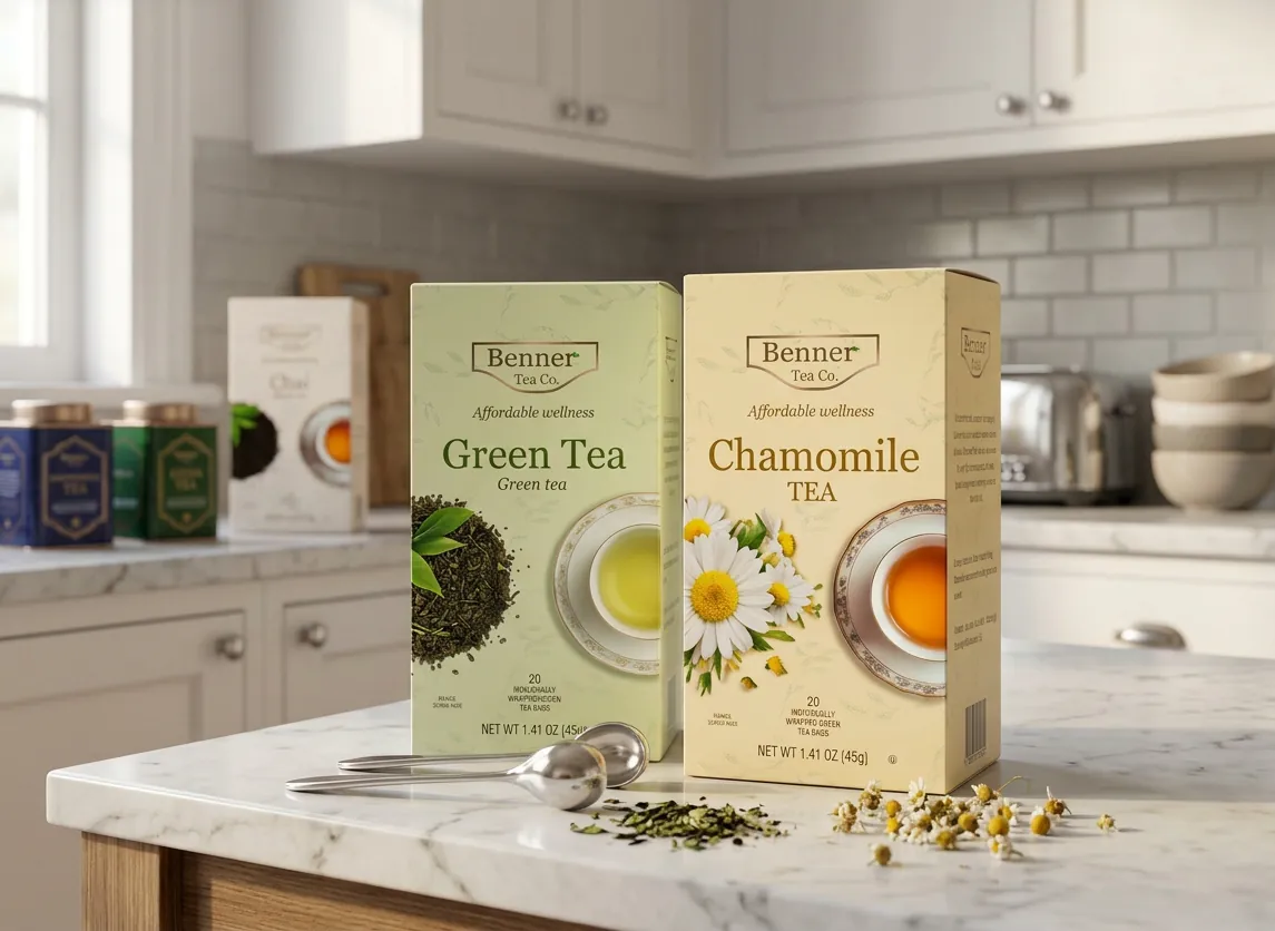
Full brand identity redesign — logo, colour palette, typography, and packaging system.
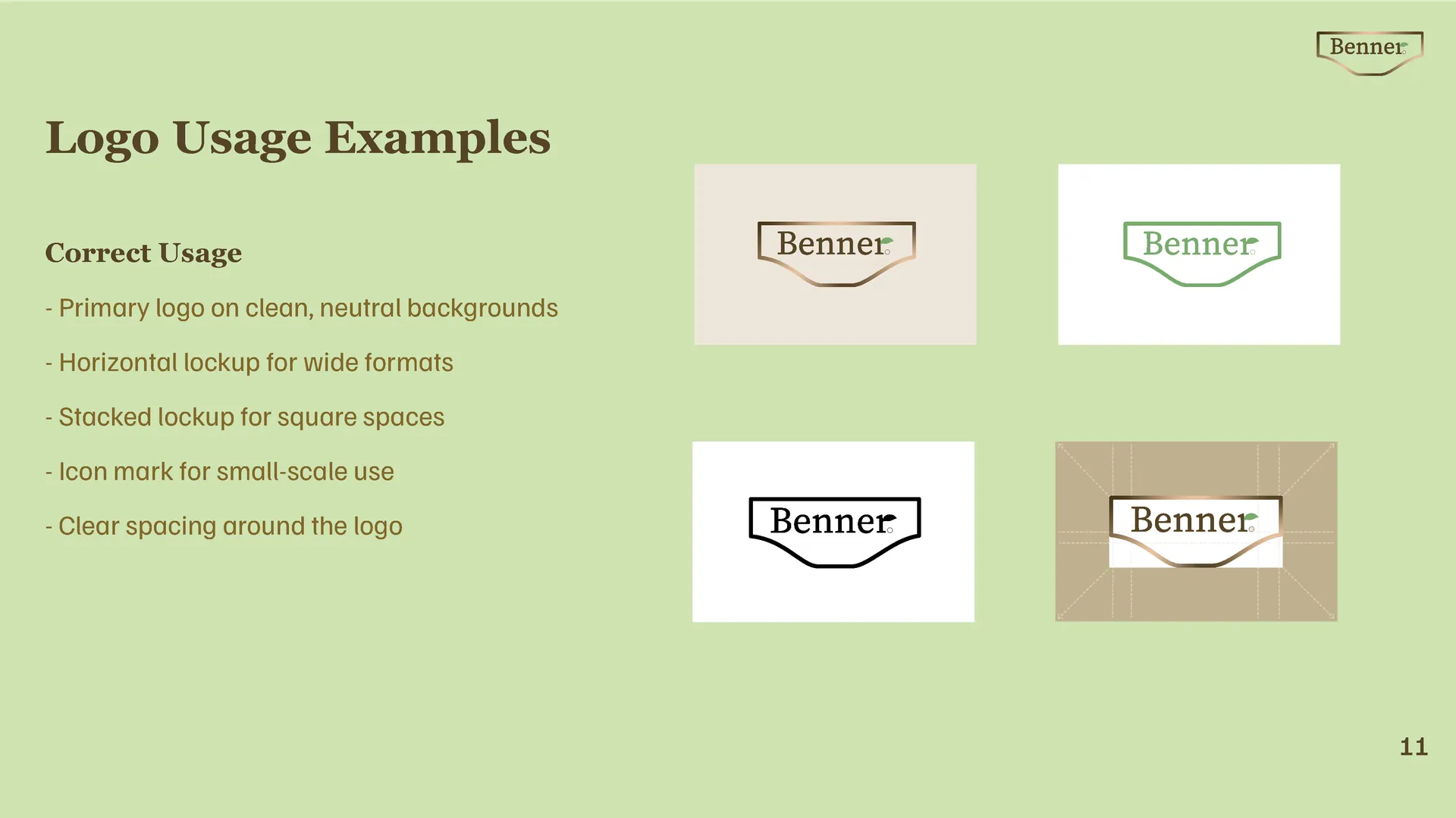
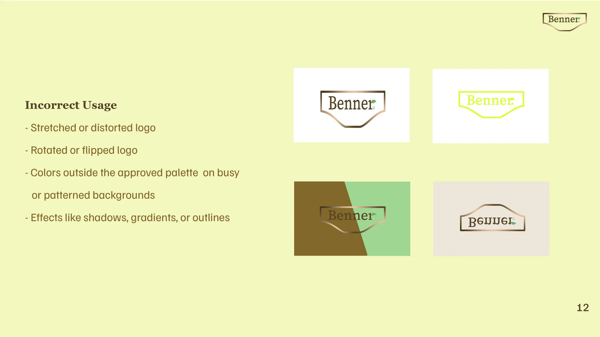
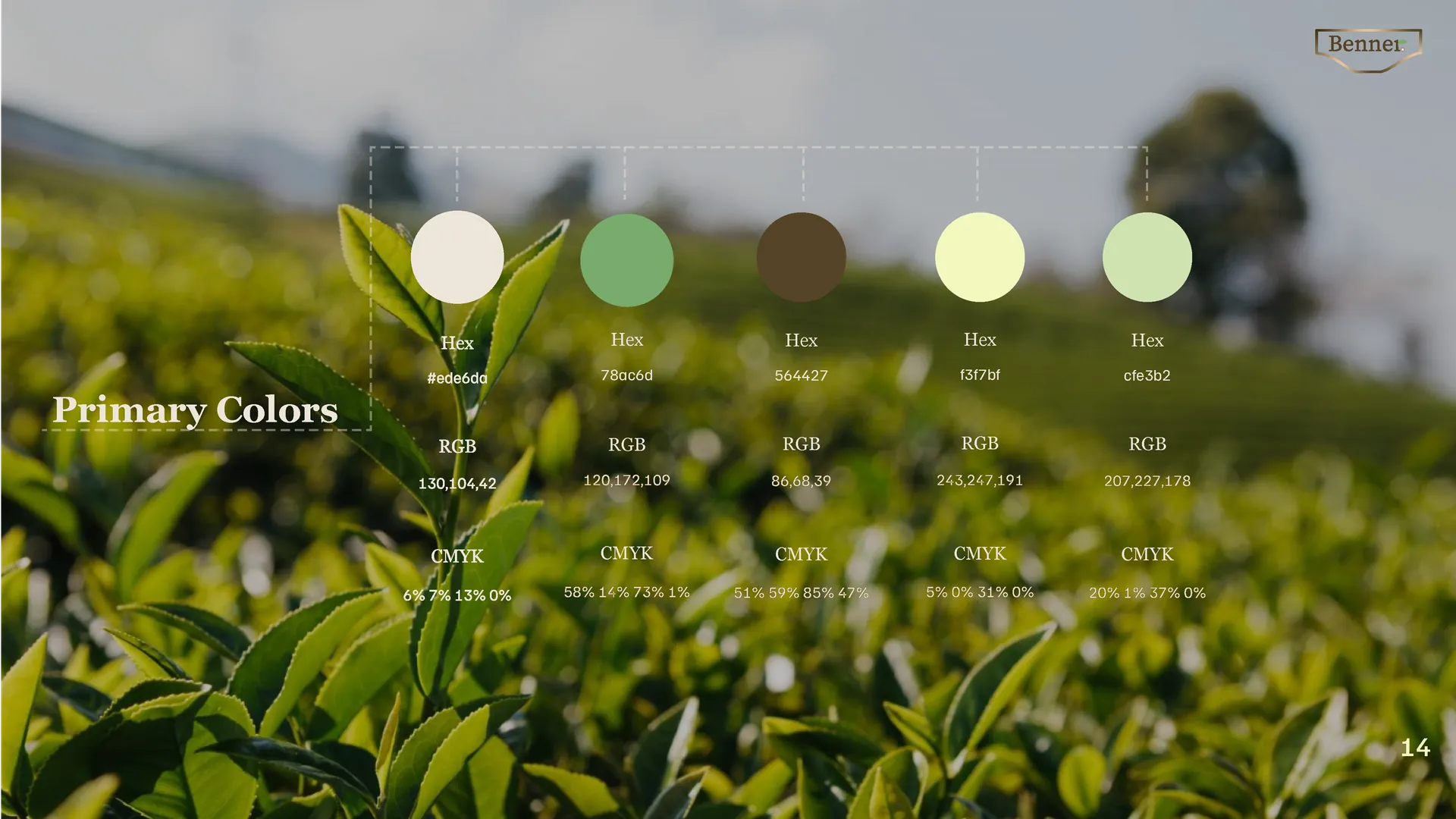
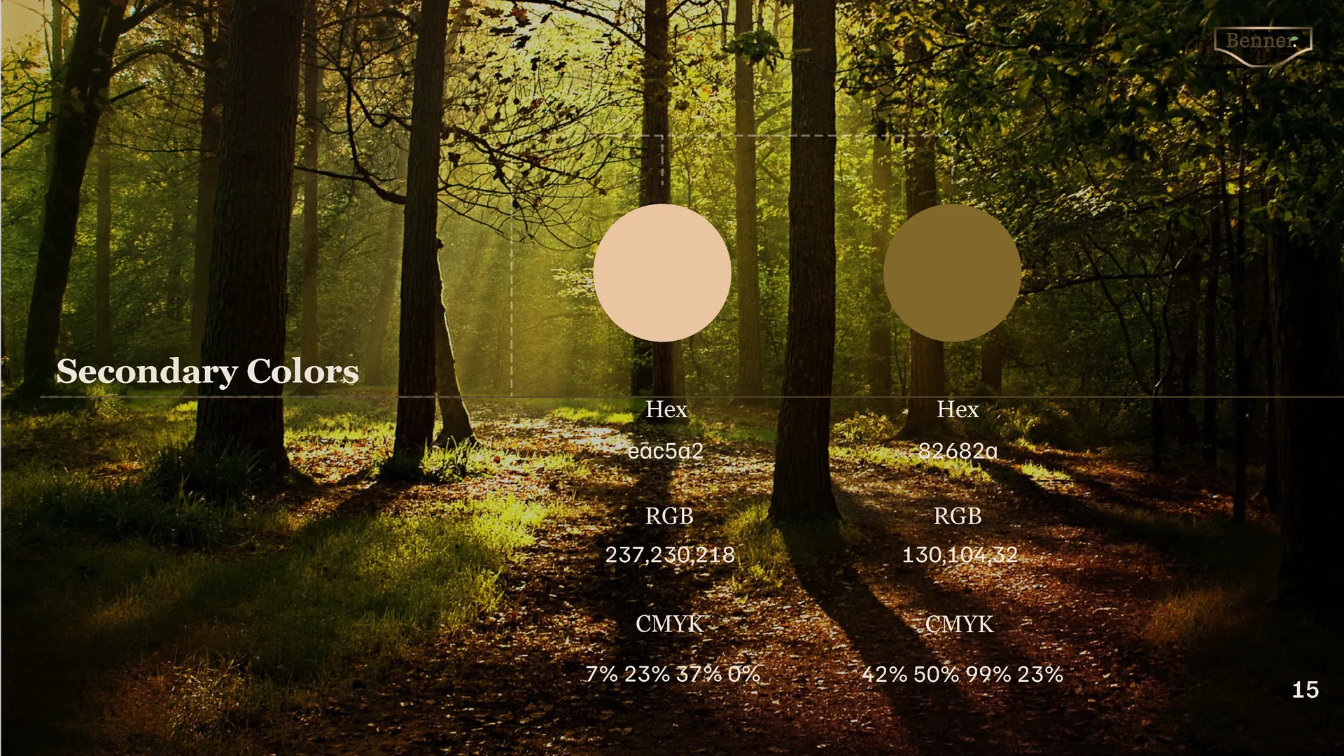
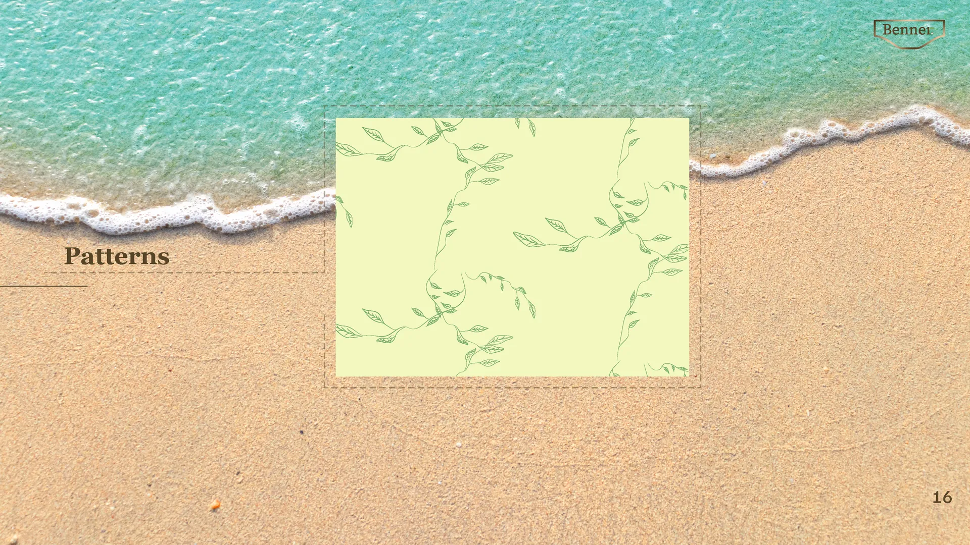
09 / Brand Guidelines
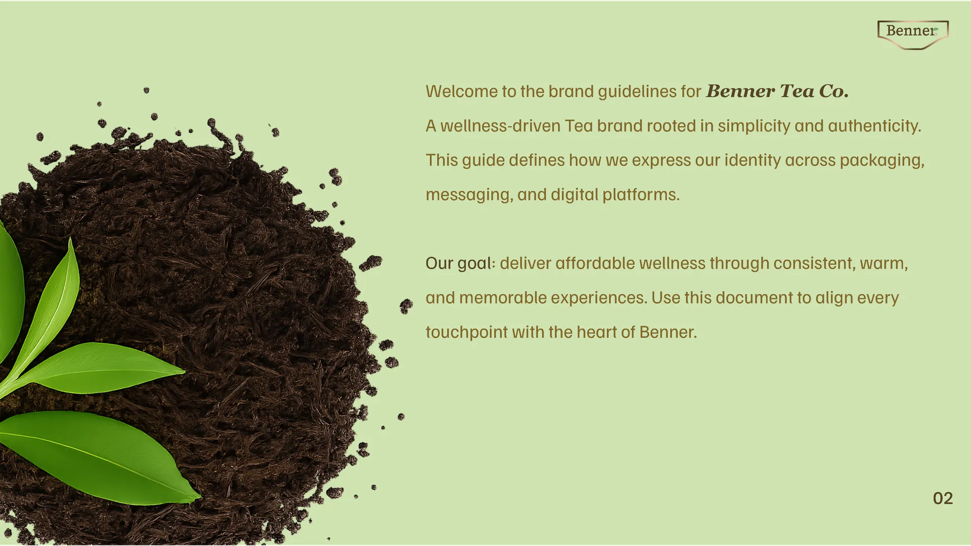
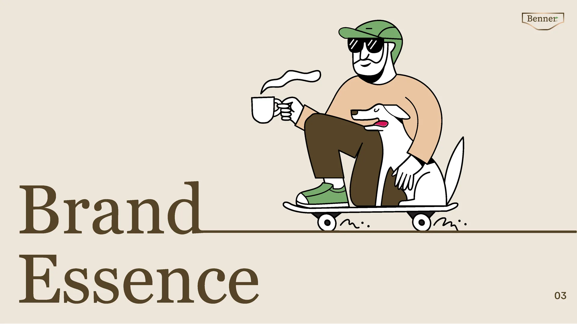
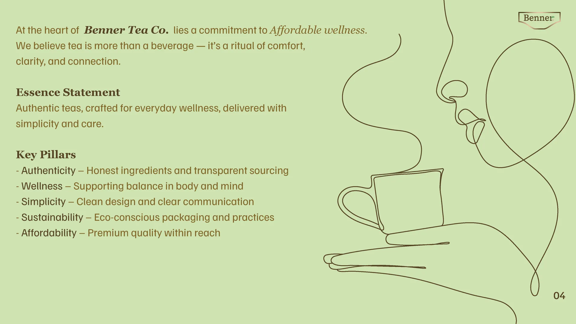
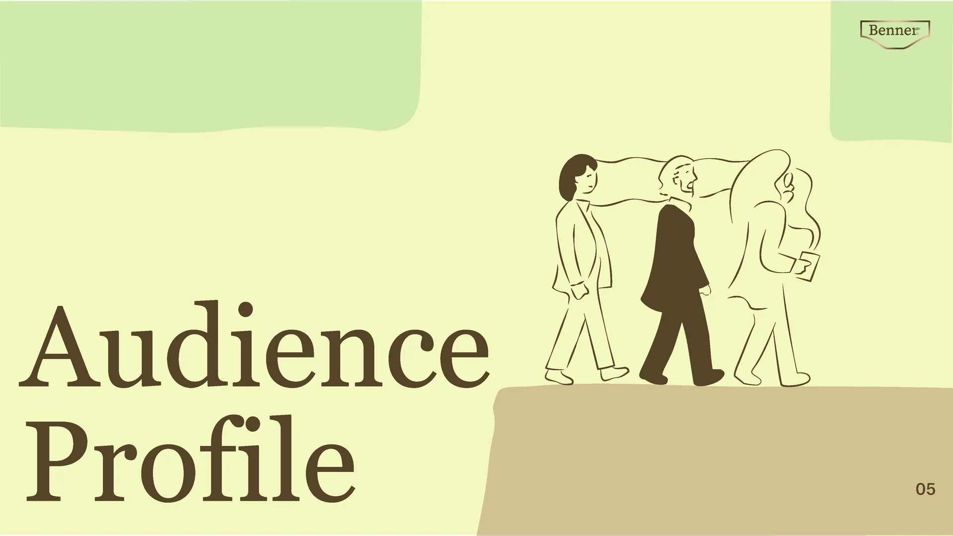
Brandbook for Benner Tea Co.
02 / Problem
No clear visual identity.
No brand recognition.
The existing brand had no consistent colour system, no defined typeface, and packaging that looked like every other tea on the shelf. It needed a complete visual overhaul.
03 / Direction
Clean. Minimal.
Built to stand out.
The goal was a restrained visual system — flat layout, earthy palette, strong type hierarchy — that feels premium without being loud.
04 / Design Decisions
What the system needed:
Logo
Wordmark with clean geometry. Timeless, not trendy.
Colour
Earthy neutrals. Warm tones that read as natural and premium.
Type
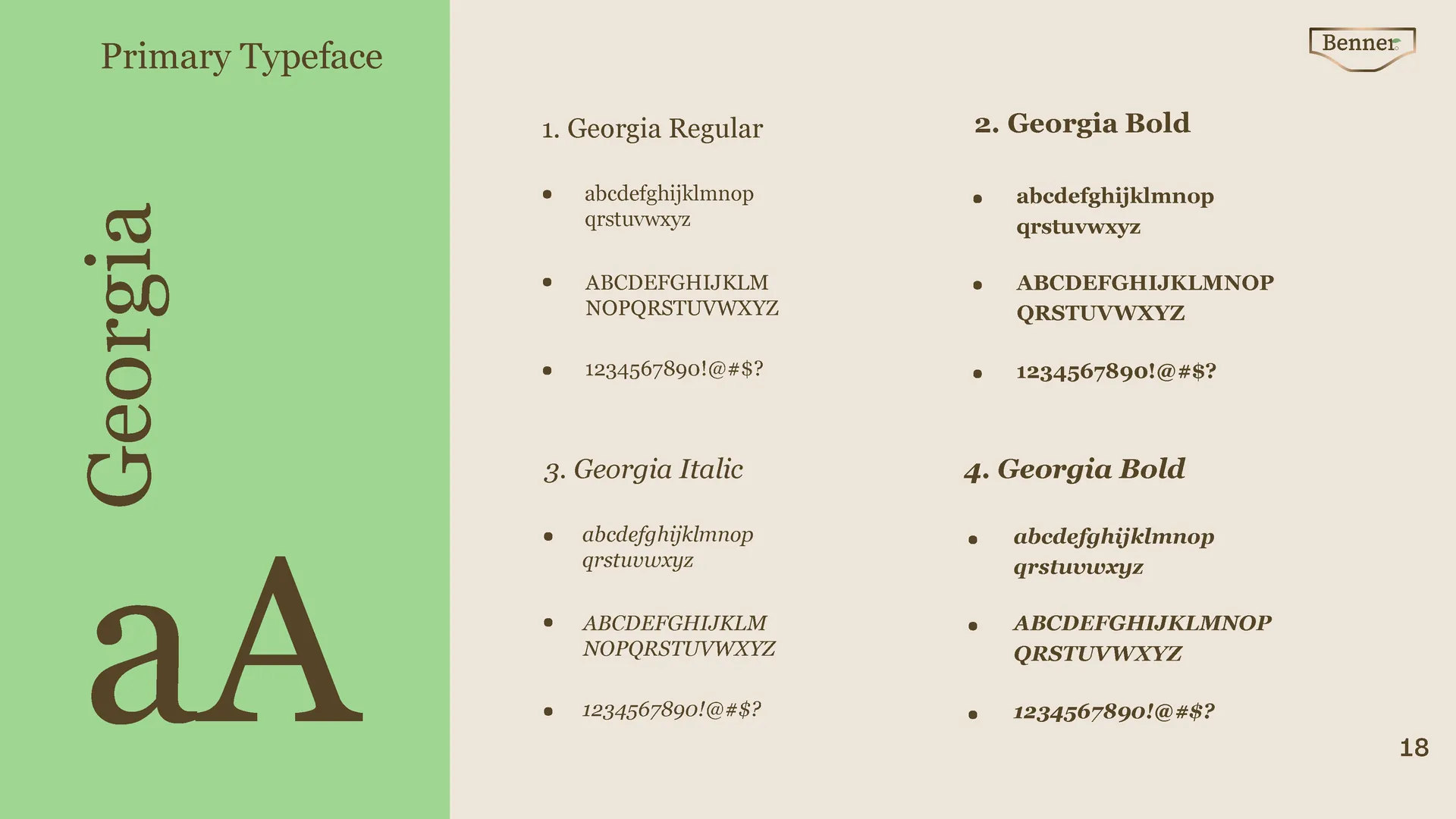
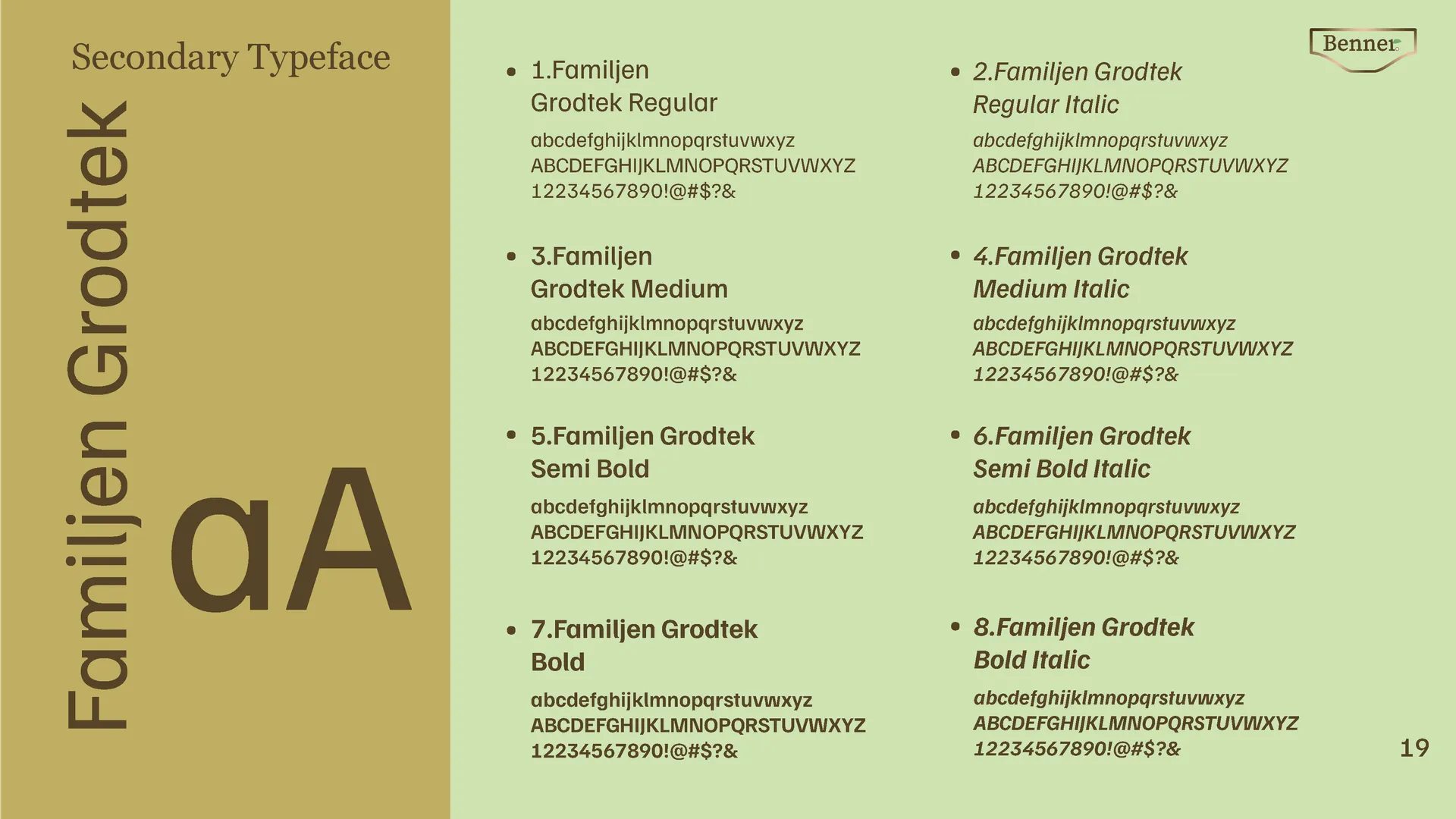
Serif for personality. Sans-serif for body. Clear hierarchy.
Target: younger audience without losing existing customers.
05 / Approach
Strip it back.
Make it count.
Removed all visual clutter. Every element — layout, spacing, colour, type — was chosen with purpose. Nothing decorative that doesn't serve the brand.
06 / Deliverables
Logo System
Primary mark, secondary lockup, and monogram. Light and dark versions.
Colour Palette
6-colour system. Primary, secondary, and neutral tones with usage rules.
Type System
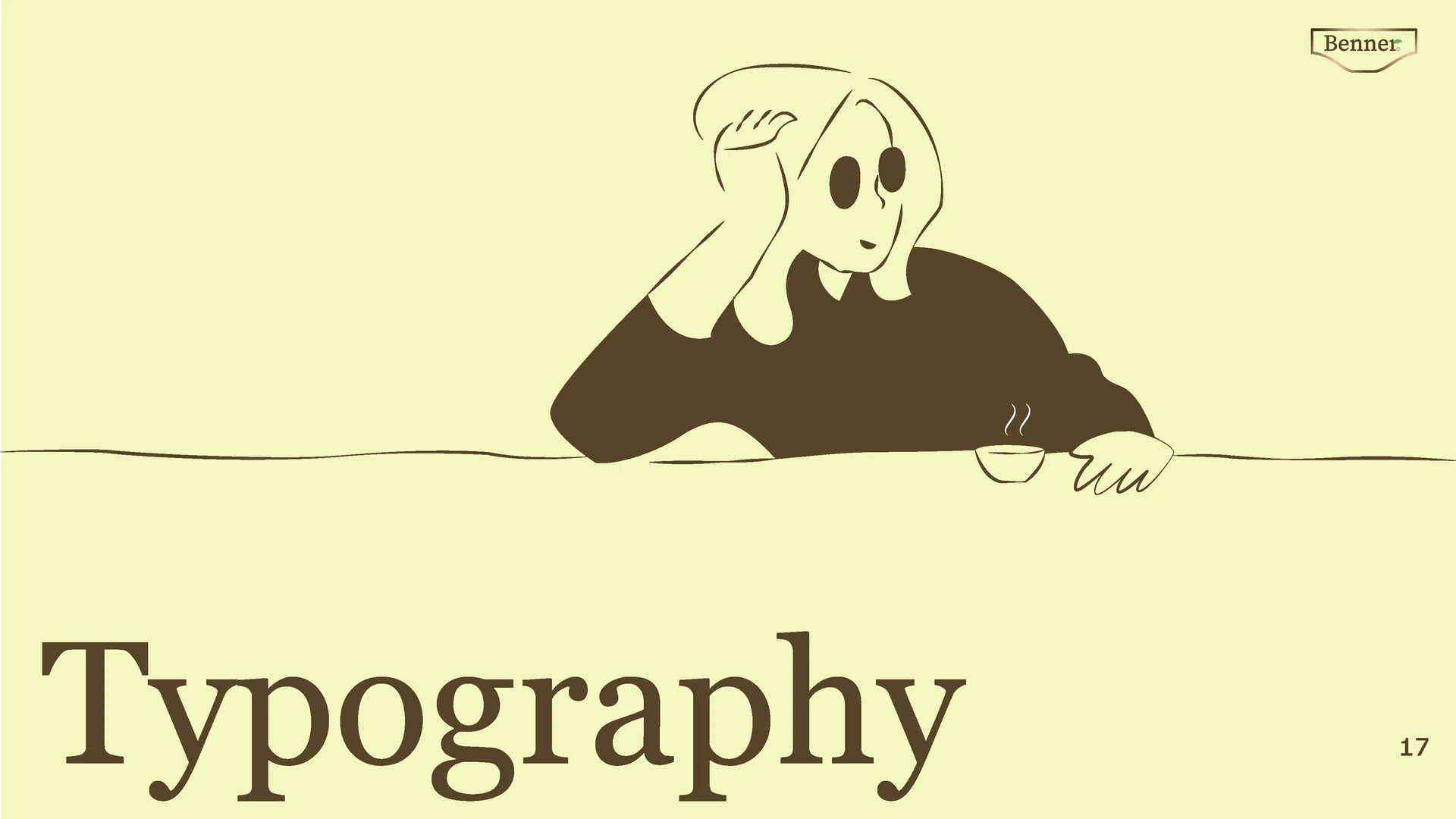
2 typefaces. Heading, subheading, and body styles defined across all formats.
07 / Result
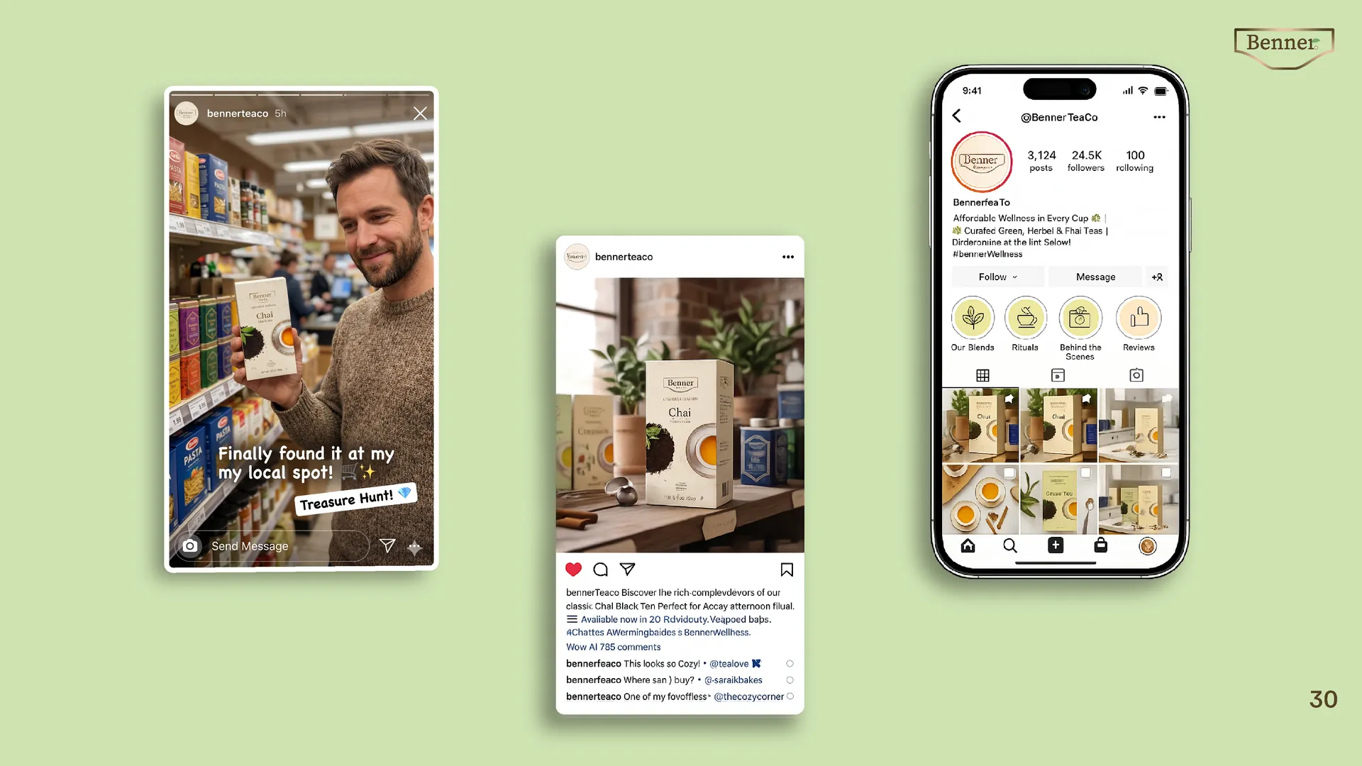
A complete brand system — ready across print, packaging, and digital.
29-page brand guidelines document. Full mockup set included.
02 — Project
Luke's
Iced Coffee
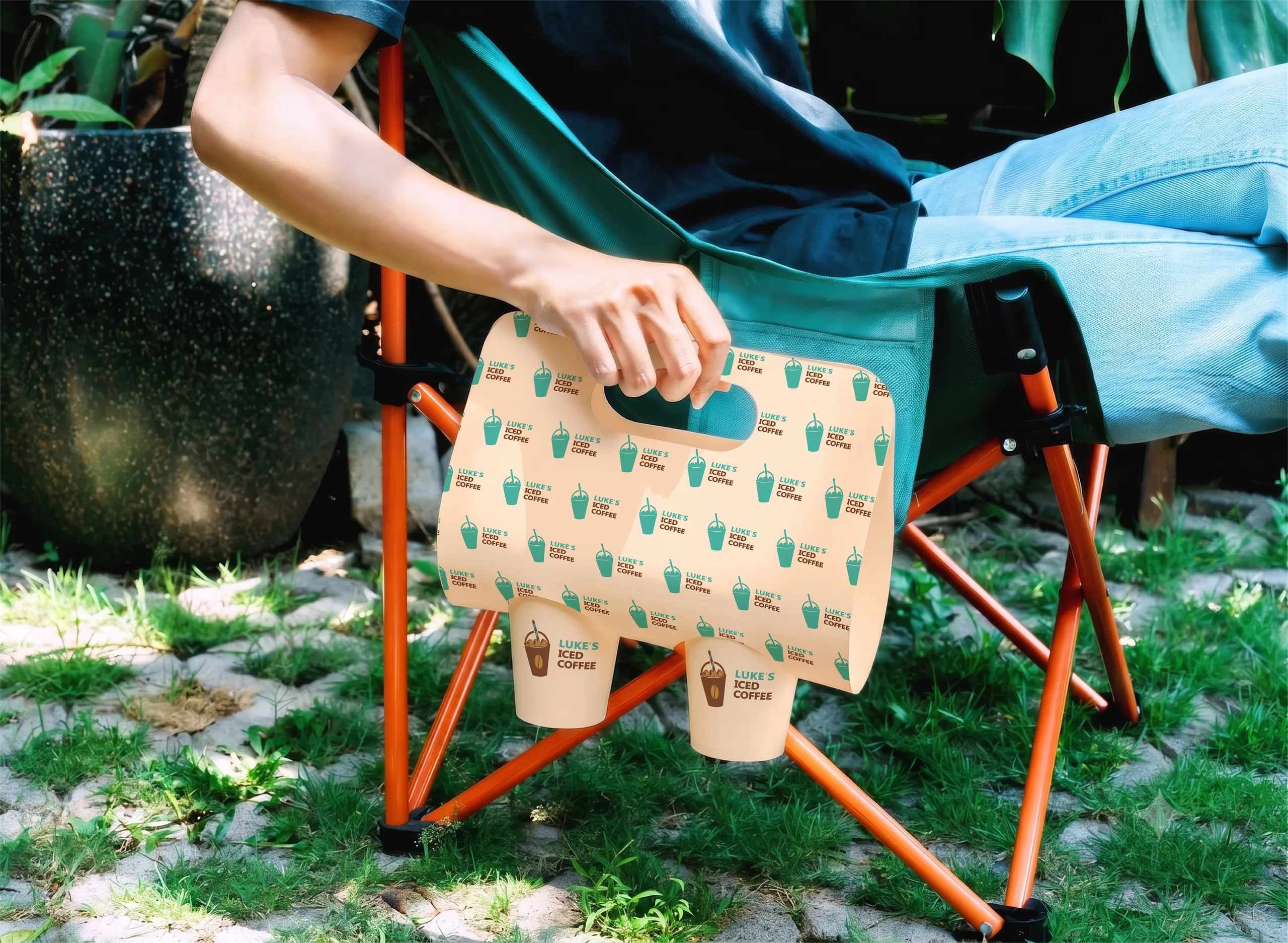
Targeted collateral design — logo, menu layout, business cards, and packaging system.
Brand Applications
In context.
Colour Palette
Warmth & Cold.
Two opposing tones — coffee brown and iced blue — create the core tension of the brand. Minimal palette, maximum recognition.
Base
Warm Cream
Primary
Coffee Brown
Secondary
Iced Blue
Highlight
Sunset Orange
02 / Problem
Outdated collateral.
Low shelf impact.
Luke's had a great product, but their touchpoints — packaging, menus, and business cards — failed to communicate what made them unique. The logo lacked legibility, and the physical items didn't feel cohesive.
03 / Direction
Young. Bold.
High contrast.
The goal was to redesign specific core assets to appeal to a Gen-Z and student demographic. Every delivered piece needed to feel punchy, modern, and instantly recognizable.
04 / Design Decisions
What the system needed:
Logo
Bold wordmark. Confident and legible on small labels.
Menu & Print
Clear typographic hierarchy. Functional business cards.
Packaging
High-impact layout rules that work across cups and cans.
Target: Gen-Z and students. Everyday product, premium feel.
05 / Approach
High contrast.
High energy.
Kept the design expressive but controlled. Strong type hierarchy, a two-tone palette, and clean layout rules that work across cups, packaging, and digital.
06 / Deliverables
Logo Design
Primary wordmark and lockup variations.
Print Assets
Menu layout and two-sided business cards.
Packaging
Cup designs and retail product packaging.
07 / Result
Targeted deliverables ready for production.
Logo files, print-ready menus, business cards, and packaging mechanicals delivered.
03 — Project
Posters &
Album Arts
01 / Project Overview
Dark Aesthetics.
Heavy Metal.
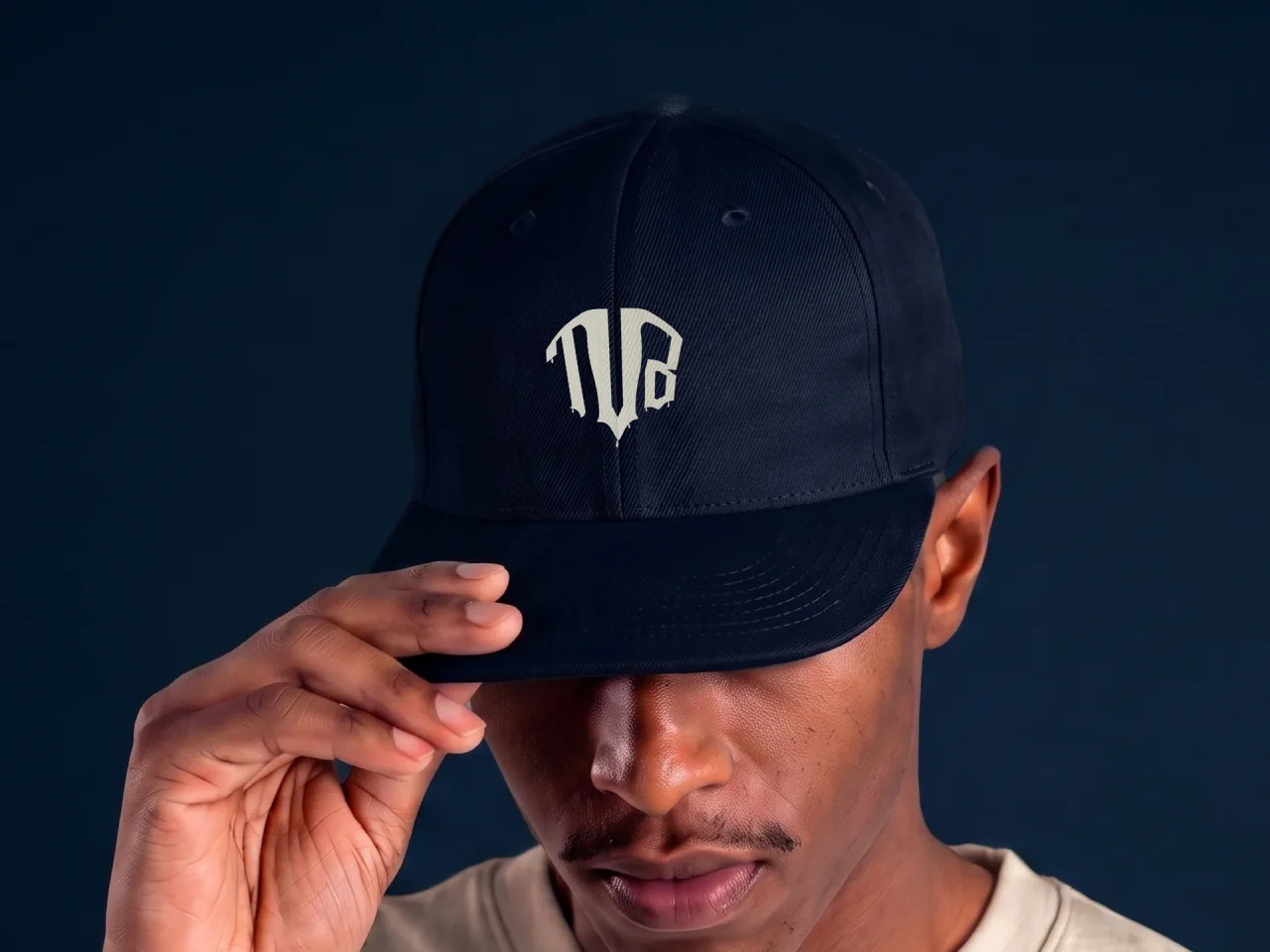
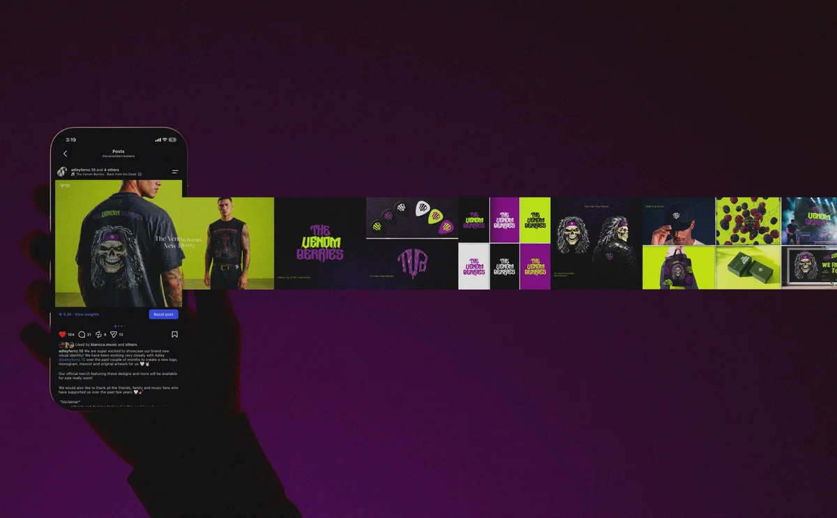
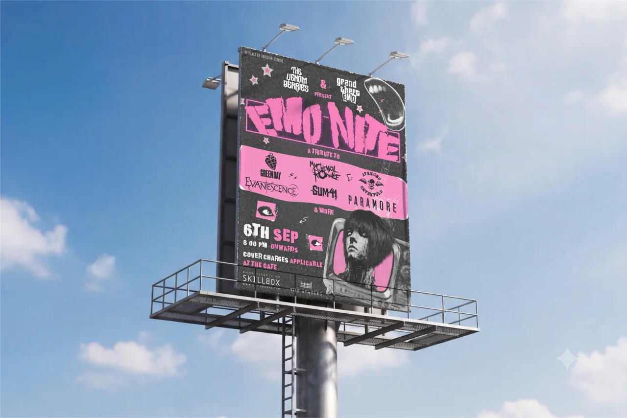
Promotional poster designed for a metalcore band's live concert. The objective was to capture the band's aggressive energy while creating a visually striking asset for social media, print, and event promotion.
Client
The Venom Berries
Industry
Music
Services
Poster Design, Art Direction
Tools
Adobe Photoshop, Illustrator
Year
2026
02 / Album Art
Visual Storytelling.
Strategic Design.
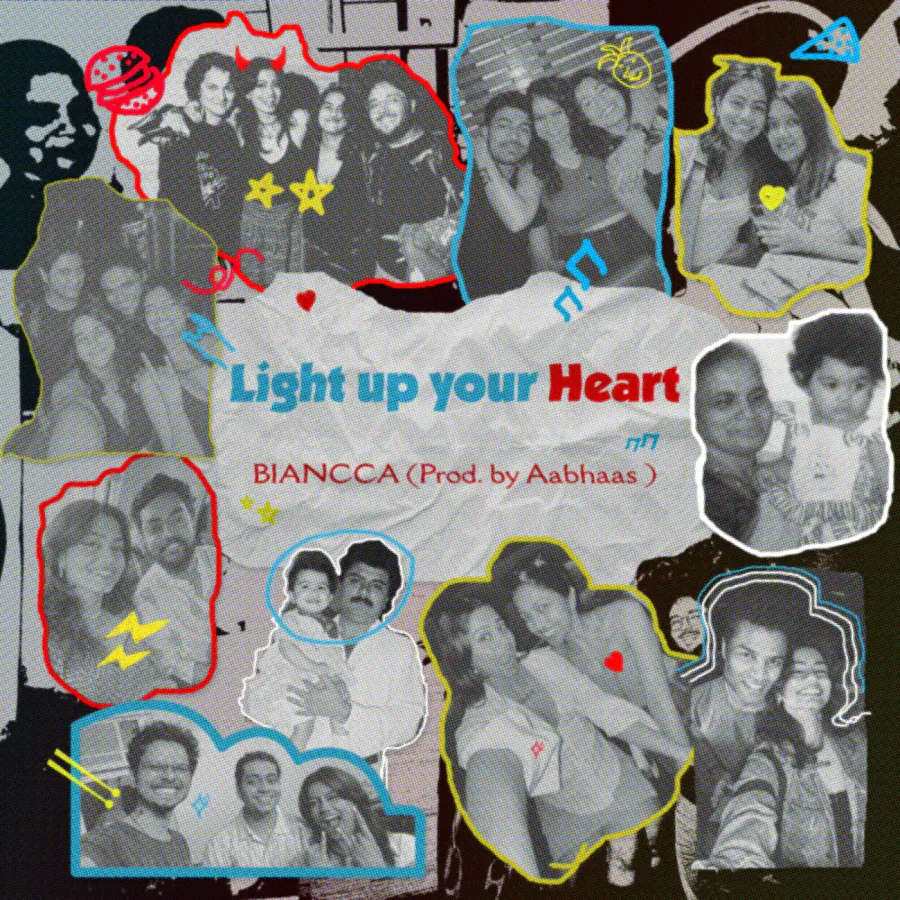
A custom cover design created to reflect the artist's unique sound, mood, and creative identity. Combining visual storytelling with strategic design, the artwork was crafted for both digital streaming platforms and promotional use.
Album art for BIANCCA
Client
BIANCCA
Industry
Music
Services
Album Artwork, Art Direction, Typography
Tools
Adobe Photoshop, Illustrator
Year
2026
Section 02 — Design & Development
Web Design &
Development
01 — Project
The
ExecuVision
Corporate identity re-design & custom high-performance web development.
01 / The Challenge
Legacy code.
High latency.
Transforming a low-quality, buggy legacy site into a structured, high-speed platform. The existing site suffered from extreme latency and a complete lack of visual hierarchy.
02 / Concept
Surgical.
High-performance.
A surgical re-imagining of corporate identity through high-performance digital architecture. Focused on a content-first philosophy, stripping away noise for a minimal aesthetic.
03 / Transformation
Legacy State
New Vision
04 / Process
Architecture
Built a new data structure to eliminate lagging. Implemented a strict 12-column grid system.
Development
Rebuilt the tech stack for maximum responsiveness. Fixed legacy bugs for zero-lag interactions.
05 / Results
100% bug-free deployment.
Drastic speed improvements. Shifted the experience from a high-friction environment to a seamless, high-quality digital narrative.
02 — Project
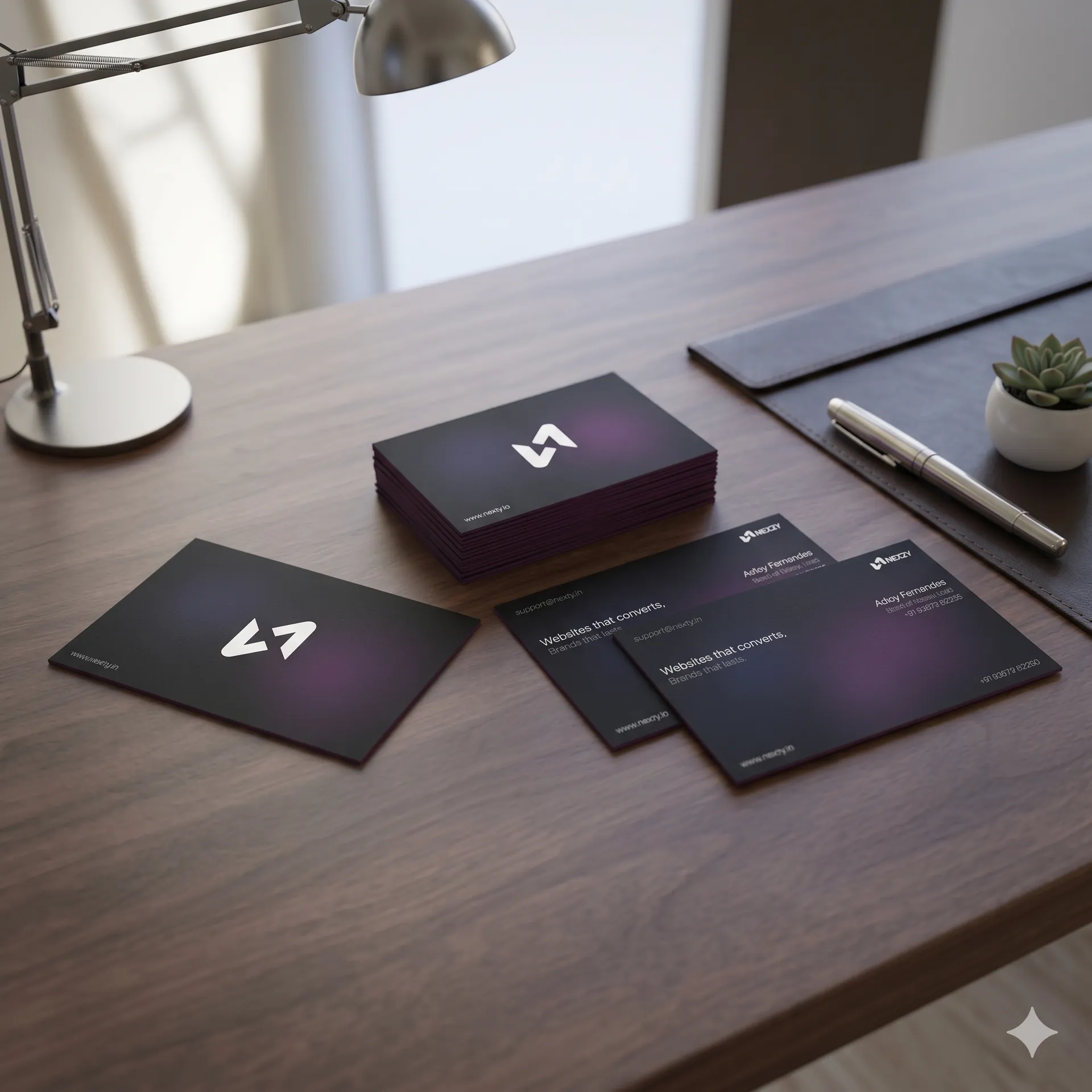
Nexzy
Growth & Tech Solutions — UI/UX design & advanced web development.
01 / The Challenge
Low visibility.
Low conversions.
Elevating the brand's digital presence to attract high-tier clients. The old site lacked a sophisticated technical portfolio and a clear conversion funnel.
02 / Concept
High-conversion.
Lead-generation.
A cutting-edge agency flagship designed to serve as a high-conversion engine. Balancing technical depth with visual impact to convey innovation.
03 / Process
Architecture
Architected a lead-centric user journey. Pioneered a 'Future-Forward' aesthetic with geometric spacing.
Development
Engineered a high-performance 'Tech Sea' animation. Leveraged hardware acceleration for fluid motion.
04 / Results
100% improvement in portfolio visibility.
Significant increase in inbound inquiries. Positioned Nexzy as a market leader in tech solutions through superior UI/UX.
03 — Project
McLaren
Freelance Sketch Artist — Custom automotive artwork and concept studies.
01 / The Project
Custom Automotive Art.
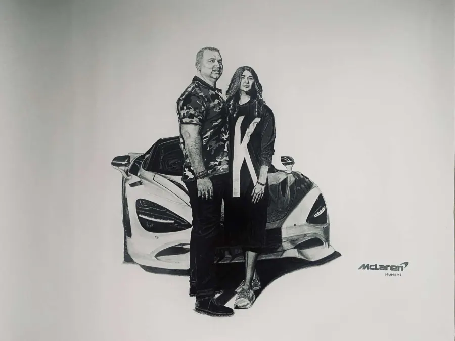
Commissioned by McLaren Mumbai to create custom automotive sketches, capturing the precise vision and aesthetic of the brand.
02 / Approach
Focus on details.
I focused on delivering high-quality artwork with meticulous attention to detail, ensuring the final pieces met the client's exact standards.
03 / Output
Deliverables
Custom automotive sketches on large A1 charts.
Medium
Traditional hand-drawn sketching.
04 / Results
On time and on point.
Delivered the detailed sketches on schedule, perfectly aligning with McLaren's requirements and vision.
04 — Project
Porsche
Freelance Sketch Artist — Custom automotive artwork and concept studies.
01 / The Project
Exclusive Commission.
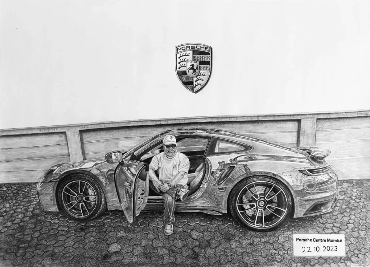
A special commission for Porsche Mumbai to create highly detailed, custom automotive artwork that reflects the brand's iconic design.
02 / Approach
Precision and quality.
I prioritized intricate detailing and clean execution, making sure every line captured the essence of the vehicles.
03 / Output
Deliverables
Custom automotive sketches on large A1 charts.
Medium
Traditional hand-drawn sketching.
04 / Results
Client satisfaction.
Successfully completed and delivered the bespoke A1 sketches, fully satisfying the client's expectations for both quality and timeline.
Kind Words
From sketching
to screens.
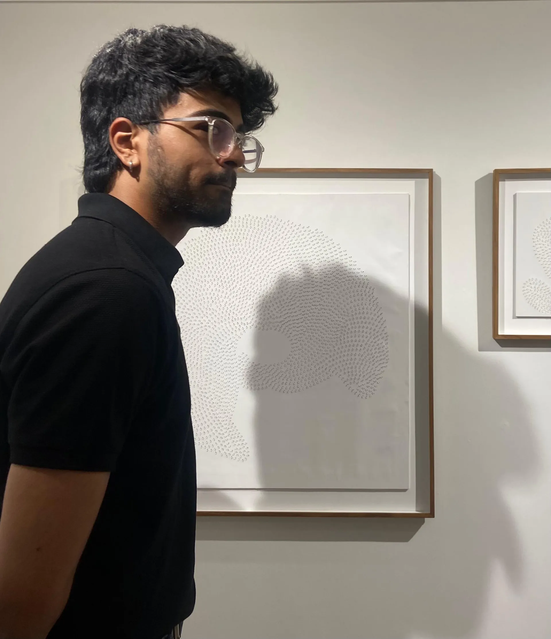
I'm Adley Fernandes, a freelance graphic designer and UI/UX designer based in Mumbai.
I partner with startups, creative businesses, and independent brands to create visual identities and websites that are both beautiful and functional.
Over the last two years I've worked across branding, digital design, and web development, helping clients turn ideas into experiences people remember.
Tools I use
I use a mix of design and development tools to bring ideas to life. Here's what I work with to build websites, create brands, and design graphics every day.
Visual Identity
Crafting brand systems that resonate through narrative and natural aesthetic intuition.
- — Brand Strategy
- — Logo Systems
- — Storytelling
Web Engineering
Building high-performance digital foundations with a focus on speed and structure.
- — Frontend Dev
- — Frameworks
- — Performance
Interface Design
Curation of movement within digital spaces to create seamless user journeys.
- — UI/UX Design
- — Interaction
- — Prototyping